
OSIsoft
PI Vision - Widget Multi-stating & Data Binding
Designing a critical feature to make configuring and monitoring real-time data visualization more effective and efficient
OVERVIEW
Widget Symbol Multi-stating is an essential feature in PI Vision, the data visualization application made by OSIsoft. It facilitates monitoring real-time data by turning objects into visual alarms. My main tasks were to design the functionality, the user flow, and the interactions for this feature based on existing user data. Due to feature dependency, I also need to redesign the data-binding mechanism & interactions to support this multi-stating feature.
Throughout the process, new designs were presented to and discussed with a wide group of stakeholders, tested through usability sessions, iterated based on feedback, and finally approved and delivered to our visual designer for polished visual design.
ROLE
UX / Interaction Design Lead
Usability Testing
WORKED WITH
- SPM + TPM
- 5 ENG Team Leads
- Design Team Manager
- Developers from each ENG team (5-8/team)
- Customer Support Engineers & Customers
TYPE
Web App
Enterprise Facing (B2B)
Data Visualization
THE Problem / User Need
For real-time operational data associated with machines/processes, the STATE of the data sometimes matters more than the exact data value.


For example, the above process engineers probably care more about whether the truck's brake temperature goes out of normal range than the exact value of the temperature.
THE Design Brief
How might we let people create and configure their data widgets properly so that they could visualize and monitor real-time data based on data states efficiently?

Success Criteria
01
Task Completion Rate
Users can successfully accomplish a widget multi-stating setup task.
02
Task Completion Efficiency/Time
User can create and multi-state a widget efficiently/within a reasonable amount of time.
03
Teams Alignment (Internal Criteria)
All teams are satisfied with the solution and would like to implement it.
THE CHALLENGE & Constraint
01
Scattered & Limited Research Data
The data we had were from previous usability testings and User Voice. There weren't many exploratory research data that could help draw a full picture of user scenarios, and we didn't have time to do more well-rounded research.
02
Large Stakeholder Group to Manage
Multiple teams were involved in the implementation of this feature due to its complexity and feature connection. I had to coordinate and get buy-ins from all teams. Managing feedback from all perspectives and communicating trade-offs convincingly to move everyone forward was the biggest challenge.
03
App Architecture Constraint
This feature was dependent on a larger app architecture, which couldn't be altered due to the scope. I had to design within this frame and a limited real estate and find workarounds constantly. This feature was also tightly connected with the larger data-binding workflow, so I needed to redesign that flow as well.
The Solution
Introducing the Widget Multi-stating feature together with an updated data-binding mechanism into the app
Multi-stating is an advanced but essential feature for monitoring real-time data. It can turn display objects like gauges and shapes into visual alarms by altering their properties (e.g., color) based on dynamic data values.

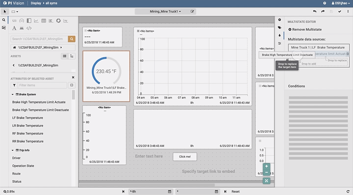
[1.] The Interactive Prototype of Multi-state Data and Widget Configuration Flow:
[2.] Two ways of adding multi-state data sources:

Design Highlights
User-Centered & Data-Driven Decision Making
The design was initialized with analyzing past user data. As we proceeded I conducted more rounds of usability and contextual inquiry sessions to validate the design. When internal and users' preferences differed (e.g., a cleaner UI) I updated the designs to reflect user preference and re-aligned all stakeholders with rationales.
Intuitive Data Binding Workflow
Enabled two ways of adding multi-state driver data source: 1.) Drag-and-drop to data list is consistent with user expectations. 2.) Context menu at the data origin is used as a shortcut.
Complexity Simplified
There were multiple use cases associated with the multi-stating feature, which complicated the logic. I simplified the workflow for the primary use case with sufficient support to the other cases. This simplified the logic that users need to tackle.
Improved Efficiency
I simplified multiple interactions (e.g., fewer clicks) and added additional functionalities (e.g., configuration preview) to save users' time on completing tasks.
Clear Information Organization & Visual Hierarchy
The UI components are well organized despite the complexity and the dense information needed to be presented. There's a clearer visual hierarchy for users to comprehend the relationship between different elements. Our visual designer was going to further polish the UI.
Effective Usage of Limited Space
I used dynamic revealing interactions and collapsible panels to minimize the space consumed by various parts without sacrificing too much whitespace or necessary contextual information.
How did we get here?
Move on to learn about the detailed design process.
MY Overall Process

TASK Breakdown
The design for this big feature was divided into 2 parts to solve 2 problems separately:
-
Multi-state Data Binding Workflow
-
Multi-state Condition Configuration
Design Part 1 - Data Binding Workflow
The first stage was to design the flow to add data sources to a symbol and initialize multi-state functionality.
PART 1 01 - Discover & Define
Learn from Customers and Develop a Point of View
1 / 1
User Data Analysis
Action Taken:
-
Reviewed and analyzed past user research data
-
Ran expert interviews
-
Reviewed and analyzed past user research data
-
Ran expert interviews

Existing Product Core Behavior:
-
Drag & drop to add/replace data on widget
-
Configure or remove data using Config panel
2 / 2
Key Insights Found
-
Drag & Drop data item is primary and natural interaction for users.
-
Users prefer to interact with widgets directly.
Challenge with Multi-stating Being Activated
How to handle the multi-stated data? Which data to replace when new data is dropped?

-
Replace only the displayed data?
-
Replace both the displayed data and the multi-stating driver data?
-
Confirm with users what they want?
PART 1 02 - DESIGN & TESTING
Exploring Possible Workflows
1 / 6
Process Flows to Explore Widget Data Drop Behavior
After identified and communicated the right problems to solve with the synthesized data, I brainstormed two possible workflows for data drop and multi-state initialization and developed process flows:

2 / 6
Wireframing - Round 1
I then developed the two possible flows into wireframes to visualize them in the context of the current app and facilitate the communications with stakeholders. The initial two designs could both solve all the issues identified from our user data.

Challenge Encountered
Stakeholder Misalignment & Missing Data
I reviewed the two possible flows with a large group of stakeholders to get their respective insights, however, the group could hardly come to a consensus on which version to proceed with. There were pros and cons in both designs, and everybody had just reasons to favor one way over the other. There was even a 3rd possible flow suggested in the meeting.
I realized that I needed to step back and draw a more comprehensive picture of user scenarios to put everyone on the same page. Even though we knew all the problems our users were facing, we didn’t know the weight of each, and there was no way for us to find the best solution for each problem and the solutions wouldn't conflict with each other. However, because the documented user data was mostly from past usability testings on old products, there was very limited exploratory data to help form complete user stories and scenarios.
Solution -
Realign all stakeholders with Design Assumptions
I had further conversations with PMs to develop more insights on our target users based on known use cases or observed user behaviors. Then I made design assumptions based on the insights. These design assumptions were then used to drive later design decisions and team discussions.
With the assumptions in mind, I revisited all previous solutions and analyzed the potential issues of each design. I then presented to the stakeholders the design assumptions and the analysis results.
Slide used to align all stakeholders on the design assumptions:

Slide used to align all stakeholders on issues with all previous demonstrated or suggested designs:

3 / 6
Wireframing - Round 2
I also wireframed a new solution, guided by my design assumptions. I presented the new design to all stakeholders, and this time, everyone was convinced and aligned on moving forward with the new direction.
Slide used to introduce the essentials of the new design to stakeholders:

Annotated new design for user scenario walkthrough:

Challenge Encountered
Multiple Working Solutions, Which Is the Best?
Although people were all aligned with the high-level direction, when it comes to the detailed interaction of the best way to drag and drop additional data sources into the data list for adding or replacing data, people had varying opinions. We needed to balance between convenience and real-estate constraints. The different approaches all worked, but we wanted to land on the best solution. I decided to prototype three possible workflows and test it out on users to resolve the debates.
4 / 6
Solution -
Prototyping & Usability Testing
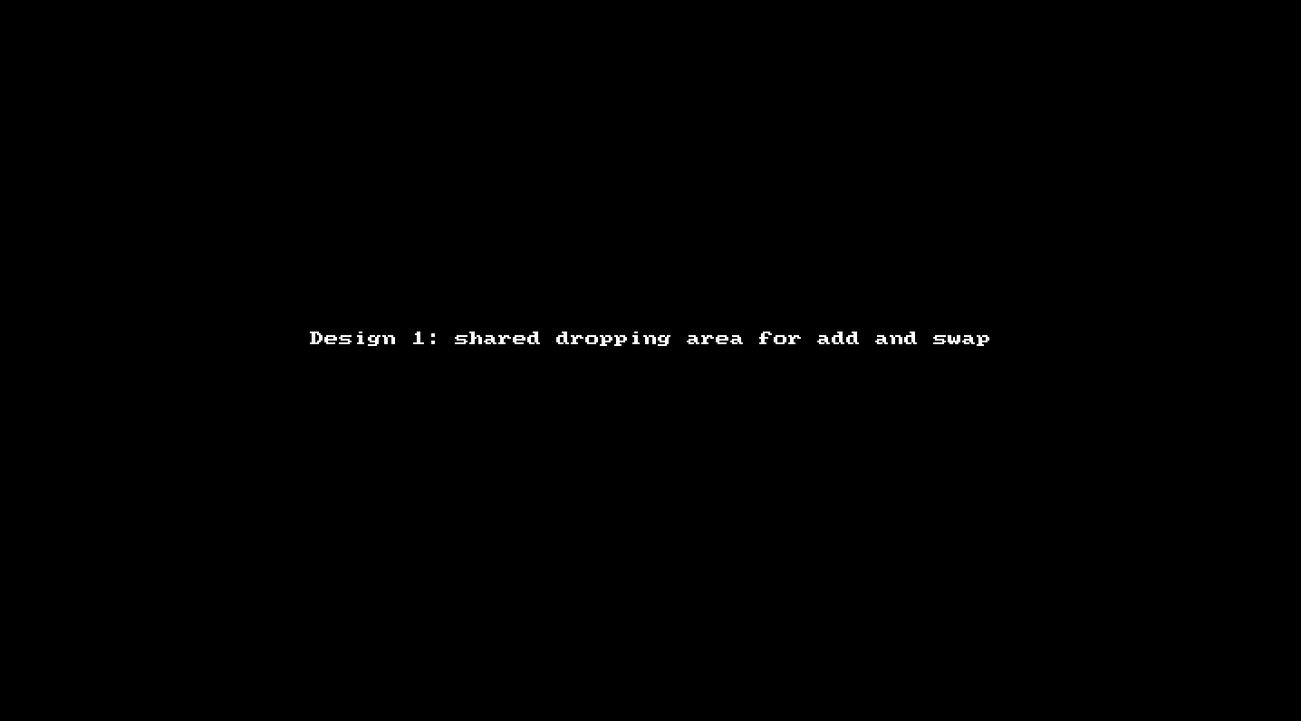
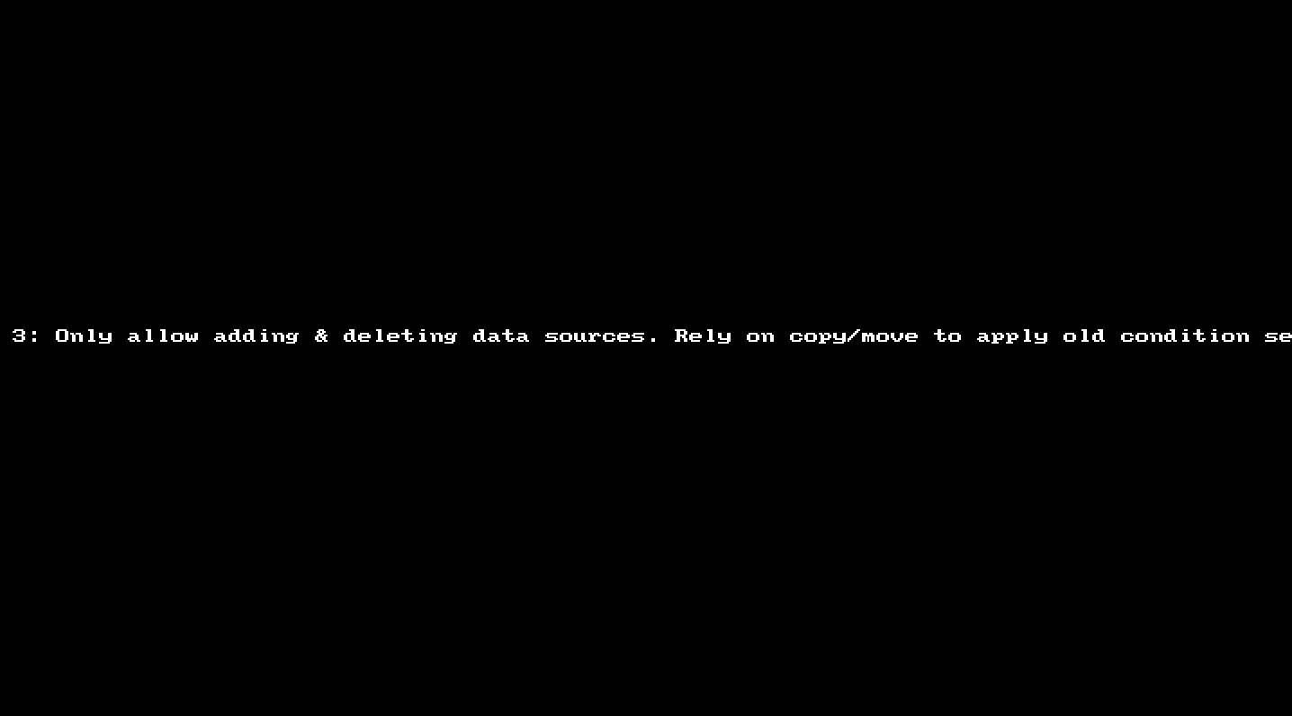
I coded three interactive prototypes in Framer, each of which represented one type of interaction for adding or replacing data item:
Design 1 - shared dropping area for add and replace, specify intention upfront:
Design 2 - Separate adding and replacing drop regions (drop on top of other data to replace):

Design 3 - Allow adding data only, rely on delete and copy/paste to replace data item :
5 / 6
Testing Analysis & Results
I conducted user testing sessions to test out the 3 designs in the form of contextual inquiry. It turned out the second design was preferred due to fewer clicks. We decided to proceed with the 2nd design with some modifications, as suggested by the testing data and internal preferences.
User testing data analysis examples:

6 / 6
Final Solution
In order to reserve more space for the multi-state condition setting panel, we decided to further compress the space occupied by the data source management panel. Therefore, the final solution was to reveal the dropping area only when data dragging is active.
Video demo of the dynamic data source management panel:
THE DESIGN PROCESS II
With alignment on the design, we then moved on to the next part of the bigger design - configuring muti-state conditions.
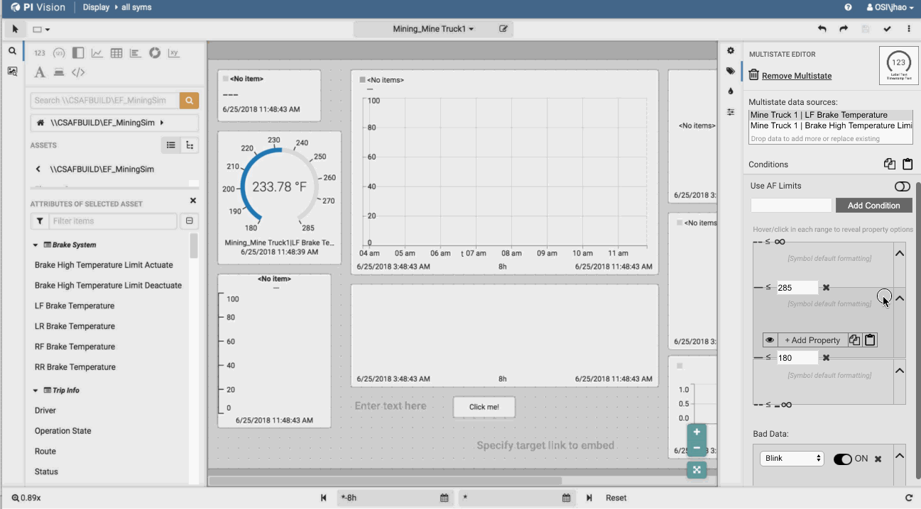
Design Part 2 - Multi-state Condition Setting
The second stage was to redesign the functionality, layout, and interaction of the condition setting pane
PART 2 01 - DESIGN
Exploring Possible Workflows
1 / 1
Wireframing
The complexity of this feature and constraints of current architecture forced us to embed a lot of controls and information into the limited panel space. After created the 1st design, I wireframed a variation (design 2)to explore the possibilities of a cleaner look.

Design 1 Layout - Persistent Utility Button Group

Design 2 Layout - Dynamic Utility Button Group (Reveal on Hover/Tap)
Design 1 had a utility button group persistent within each range, and design 2 used a dynamic revealing approach for the button group - appearing on hover/tap (mobile). In internal design reviews with all stakeholders, we decided to use design 2 for its simplified and cleaner look with a few changes. Below is the wireframed workflows for multiple user scenarios after a few iterations.

Wireframe walkthrough for multi-state condition setting user scenarios
PART 2 02 - PROTOTYPING & TESTING
Does Our Design Work Well for Users?
1 / 2
Prototyping & Usability Testing
After the design was internally approved, I then built an interactive prototype using Axure for usability testing.
I worked with another designer to create testing protocols and conducted the contextual inquiry form of usability sessions. The goal of the testing was to collect feedback on the workflow and interactions of the configuration process.
Demo of the interactive prototype built with Axure:
2 / 2
Testing Data Analysis
Affinity Mapping
After the testing, we ran an affinity mapping exercise to analyze the data collected in the sessions with one of the developers who were responsible for implementing this feature.


facilitating Affinity Mapping exercise
Finding Hightlights
After testing and data synthesis, we had a better understanding of users' workflows and confusion points. One surprising finding was that users weren’t very fond of hiding the utility buttons by default. Some specifically said that they would want the buttons to be persistent.
PART 2 03 - ITERATION
Adapt the Design to User Preference
1 / 1
Iterating the Design
With the insights got from the affinity mapping stage, I iterated the design to reflect user preferences and reviewed with all stakeholders. One big change was to make the utility button group persistent within each range so that users could easily discover and reach it, in the trade of a cleaner UI. Although the UI looked cluttered, the elements were well organized into a clear visual hierarchy. We were planning to collect more user feedback on this treatment after the design was implemented.

Final interaction design demo

User scenarios walkthrough of the final interaction design
REFLECTION
The final interaction design was communicated to and approved by all stakeholders. The team was very happy with the progress and results. The design met the success criteria that we set upfront.
By the time I left, the team had implemented an MVP version and got great user feedback. I was able to push a few nice-to-have features into the backlog for future releases as well.
What I've Learned
Handle Ambiguity with Resource Constraints
When the required data is not available and the team cannot conduct more user research, using design assumptions and relying on expert interview are a good approaches.
They help take the ambiguity out of the process, inform design decisions, provide a structured way for cross-functional team discussions, and align on solutions faster with a large group of stakeholders.
Testing on Actual Users
I was surprised to hear that many users actually didn’t like the reveal-on-hover treatment of the utility buttons. Although almost everyone in our team and several customer support engineers whom we tested with all preferred the dynamic buttons, it was obviously not as convenient as we thought to our actual users, so we turned the buttons persistent with careful organizations of visual elements in the sacrifice of a cleaner UI. We planned to get more user feedback once the feature is launched.
Managing Feedback from a Huge Group
The most difficult challenge of this project was to move designs forward while balancing and incorporating feedback from a large and diverse group of stakeholders. Since multiple areas were affected by this redesign, I had to coordinate and get buy-ins from multiple teams that were both co-located and distributed. There was usually a large variety of perspectives and opinions, and people constantly fall into debates.
I relied on frequent sync-ups to make sure that everyone’s opinion was heard in time and resorted to design principles, user data, and design assumptions to reconcile diverse viewpoints, articulate design rationales, and align people on the same page. I also invested effort in documenting designs, feedback, and decisions in detail, so that people could review the decision-making process if they were absent from a meeting or simply had questions. This helped save us a lot of back-and-forth throughout the process. The designed progressed smoothly and the team was very happy.


